Rethinking Booking and Waitlists
- Date
- Feb 2023 - Jul 2023
- Client
- Waitwhile
- Service
- UX designUser flowsPrototypingUI designComponent design
In short
I reshaped how guests book and join waitlists at Waitwhile, turning a set of separate, easy-to-break flows into one cleaner experience with a lot more range for the businesses setting it up.
The problem
The old setup had a quiet flaw: it was so flexible that a business could save a combination of settings that produced a broken or confusing booking page, and not realize it until guests started complaining. Guests had their own version of the mess. Booking and waitlisting were separate, multi-step, and a bit inconsistent, so people hit decisions they didn't need to make and some just gave up. And if a business ran multiple locations, there was no clean way to show them, so guests struggled to even find the right one.
What I set out to do
Reduce friction for guests, simplify the setup for businesses, and make it possible to build guest flows that are fast, hard to break, and actually on-brand.
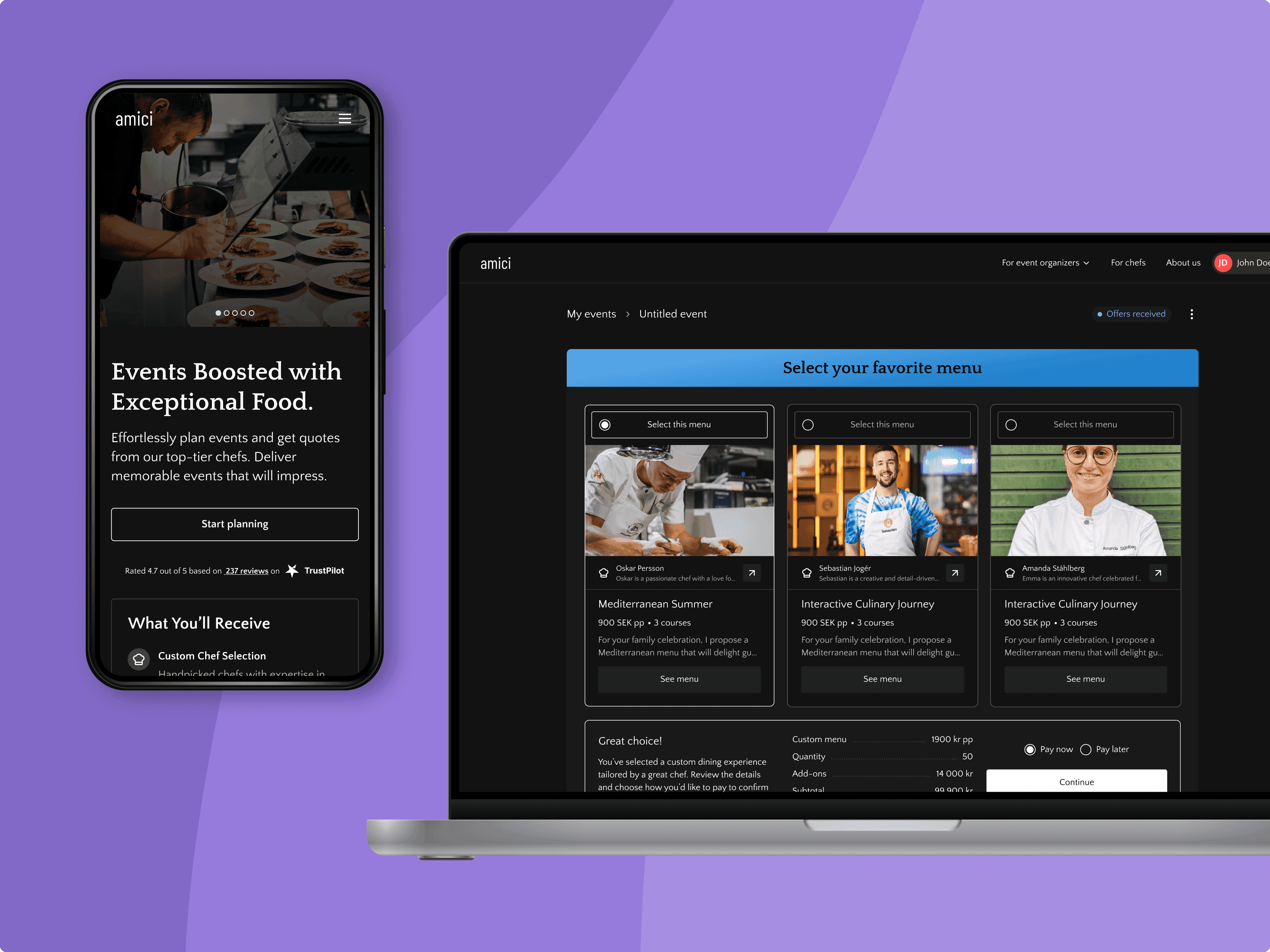
One flow instead of two
The biggest move was unifying booking and waitlisting into a single coherent flow, cutting out steps and unnecessary decision points along the way. Fewer forks, fewer chances to drop off.
Room for more than one location
I designed a scalable location directory so businesses could present all their locations in one place, making it easy for a guest to find one nearby or one offering the service they actually wanted.
More ways to show services
To give businesses more control, I added configurable display settings for how services and categories appear, including a new list view that used about 50% less vertical space than the default card layout. Guests could see more at a glance without scrolling forever.
Guardrails behind the scenes
The flashy part is the flow, but a lot of the value came from the part you don't see. I reviewed and redesigned the core settings logic so the product stopped quietly allowing setups that broke the guest experience. That alone turned a steady trickle of misconfiguration support tickets into a non-issue and freed up the support and customer-success teams from a recurring round of manual troubleshooting.
Outcome
One honest note on numbers: we don't track guest behavior for privacy and legal reasons, so the guest-side wins are judged on the design itself and on what businesses and the support team told us, not on a funnel dashboard.
- Shorter, clearer guest flows with fewer points to drop off.
- Misconfiguration tickets largely went away, saving support and success teams ongoing manual work.
- A more modular, scalable guest-experience framework to build on.
My role
I was the sole designer on this, working with one PM and three developers, and staying close to the support and customer-success teams who saw the broken setups and guest complaints firsthand. The call I'm most proud of was pushing to fix the foundation rather than bolt on another feature. A lot of the problems came from the existing flow and settings quietly allowing bad outcomes, so I argued we'd get more from redesigning how it all fit together than from piling on more options. That's the direction we went.
Reflection
This work was a good reminder that product design is as much about preventing problems as creating features. Thoughtful defaults, guardrails, and flexible views gave businesses more control and took friction out of the whole journey.